Adding Rows, Columns and Fields
Adding Rows, Columns and Fields
Adding Rows
Primary or top level rows can be added using the 'Add Row' button at the top of the layout editor this then offers a popup options window for the row - the content of this popup depends on the output framework you have chosen. The following example is configured to use BootStrap 3

The options mainly relate to the layout, positioning of and number of columns the row should contain.
Taking these options in turn:
Column Presentation: You have the choice of outputting your columns as 'framework containers' which are normal grid elements of our layout as defined in the framework you are using, or 'framework tabs' which gives you the option to output your 'columns' as tabs within your specified framework
Column Container Class for Framework: This controls the default class name and tag used to generate the column container (i.e. your Row) in your framework. In Bootstrap 3 there is a choice of 'container' of 'container-fluid'. You should familiarise yourself with the specifics of your framework if you want to change these settings from the default value.
Number of columns in your grid: This controls how many columns are included in your row - the choice may be limited by the framework you are using. For example Bootstrap3 only allows for 1, 2, 3, 4, 6 or 12 columns.
Customise Column Layout: You can specify how wide relative to each other your columns should be - Note that these fractions should always add up to 1. So if you have 2 columns and you want the left one twice as wide as the right you would set this to '2/3 1/3'.
Customise for small devices: In some frameworks you can have different relative column widths dependent on the size of the device viewing the page - using this checkbox you can make this customisation.
CSS Class name for Row: Here you can specify an additional CSS class name for the row container in addition to the "Column Container Class for Framework" above.
HTML Wrapper: You can add additional HTML before and after the Row using these options.
Adding Columns
Columns are added via the row customisation button
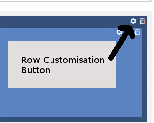
You will then see the customisation popup in the screenshot at the top of this article where you can add to the number of columns and change their relative widths.
Adding Fields
Fields are added via the small '+' icon in any column.

You are then presented with a popup dialog where you can choose to either add a sub-row or a display field.

To make it easier to find the display field you are looking for the fields are grouped broadly by type:
- Core Content Fields
- Images and Links
- Information and Icons
- Fields from EasyLayouts
- Warning Fields
- Advanced Fields